


I know making a moon with css sounds easy and simple but someone quote RTed one of my tweets
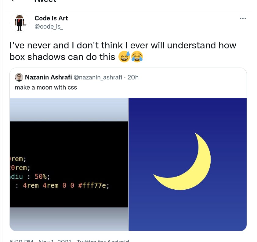
So I thought I should make a quick post about it
If I were to explain how box-shadow property can make a moon, I'd say :
Imagine there's a hidden circle and moon is the shadow of this hidden circle.
Here, let me show you :
1. First let's ignore the box-shadow and make a circle
.moon {
    width: 15rem;
    height: 15rem;
    border-radius: 50%;
    background: #fff77e;
}

2. Now give it box-shadow property
.moon {
    width: 15rem;
    height: 15rem;
    border-radius: 50%;
    background: #fff77e;
    box-shadow: 2rem 2rem 0 0 red;
}
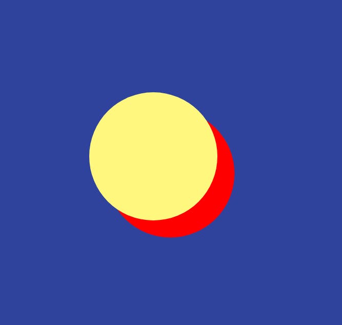
The red box-shadow looks like a moon, doesn't it?
3. Now remove the background color and you just created a moon
.moon {
    width: 15rem;
    height: 15rem;
    border-radius: 50%;
    box-shadow: 2rem 2rem 0 0 #fff77e;
}

And here's the pen :