

I like playing around with stuff and making new things.
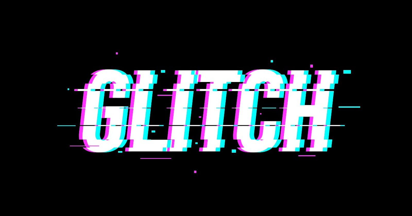
I was trying to make a glitch effect and had something completely different in mind, but the result turned out to be this glitch effect which I liked btw.
And now I'll show you how to make this glitch effect
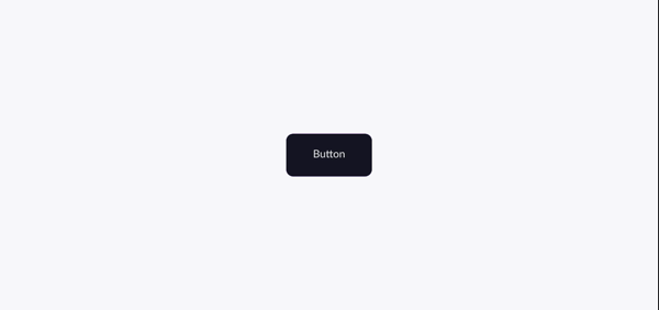
This is what we're going to make :
Let's get started.
Now, first thing first
Setting up html :
<div class="box">
        <a href="#">Button</a>
    </div>
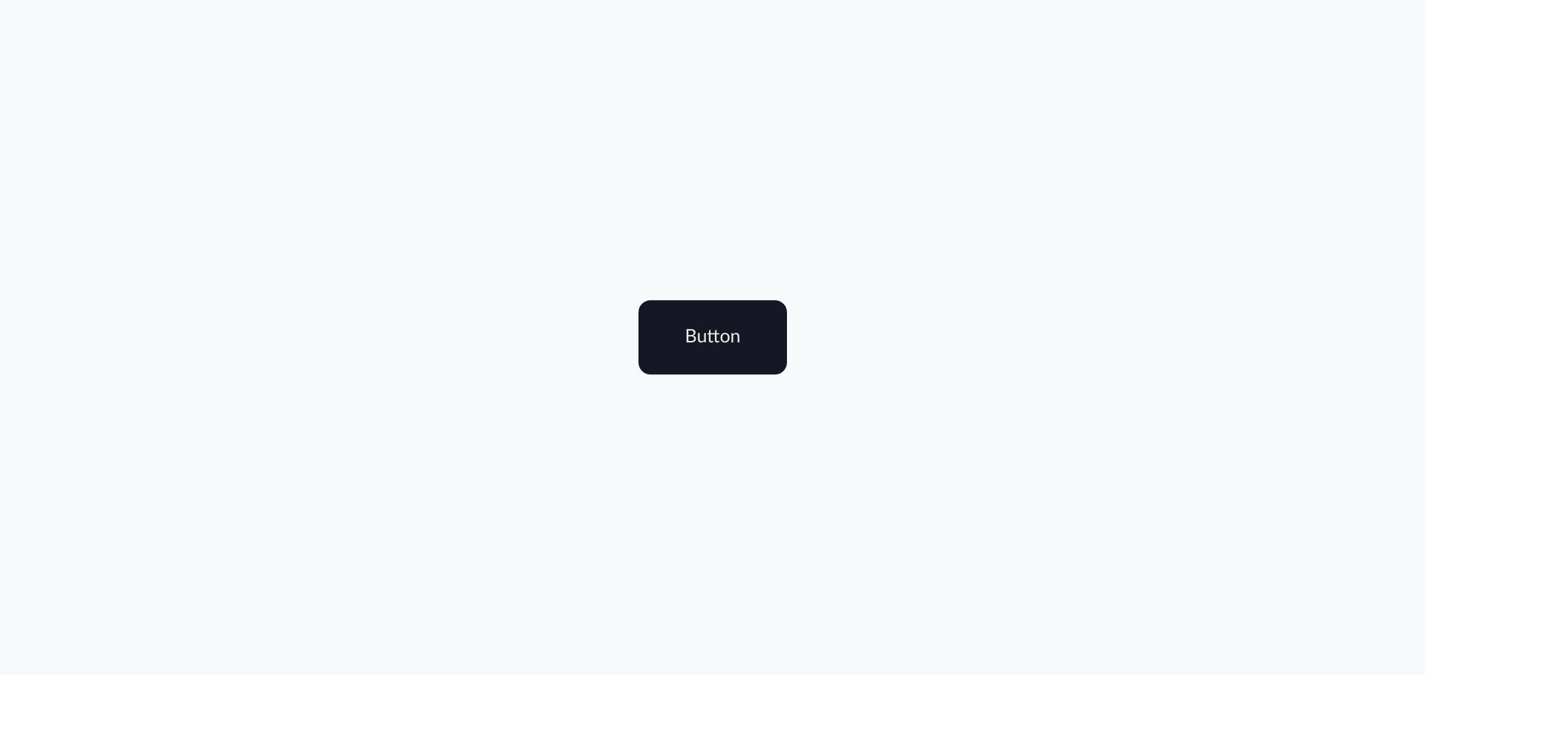
I created the box class to center the button, and used the anchor tag for the button.
Setting up css :
After setting up the html, it's time to have fun with css.
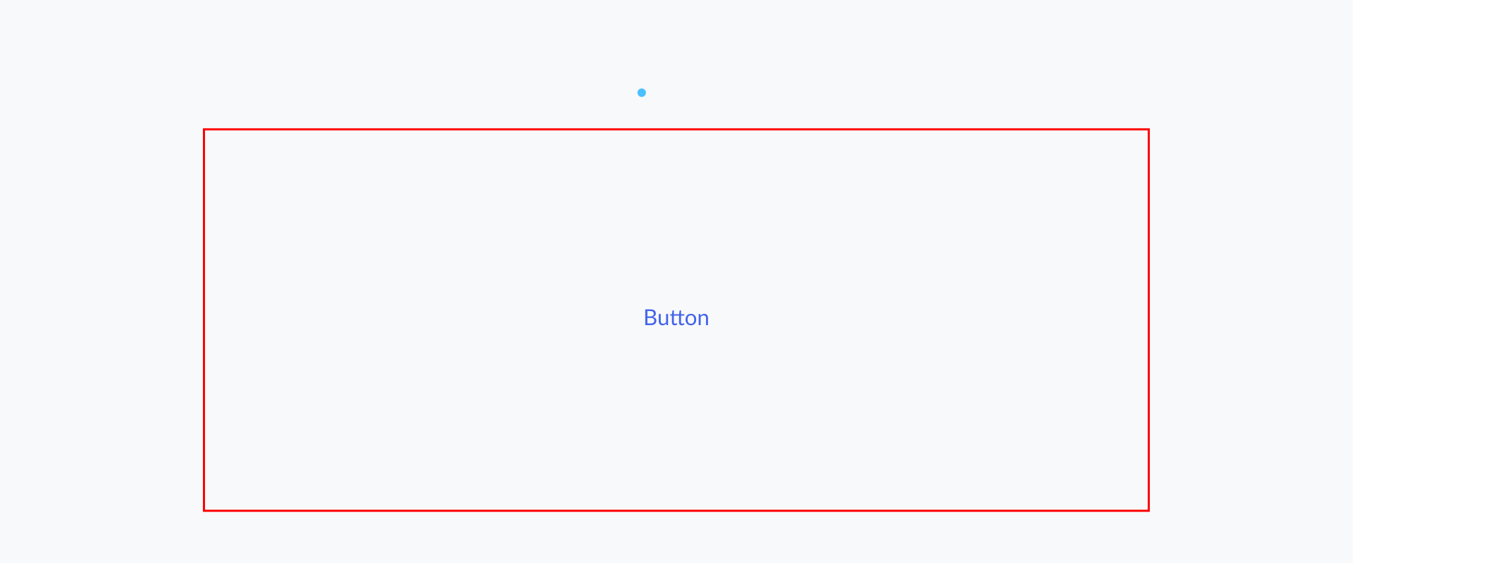
- Centering the box:
Before styling the button and glitch effect, I'm gonna center the box, because I know how much you guys love centering divs , right?
.box {
    width: 70%;
    min-height: 60vh;
    border: solid red 2px;
    /* Centering the box */
    position: absolute;
    left: 50%;
    top: 50%;
    transform: translate(-50%, -50%);
    /* centering the content, aka the button,inside of the box */
    display: flex;
    align-items: center;
    justify-content: center;
}
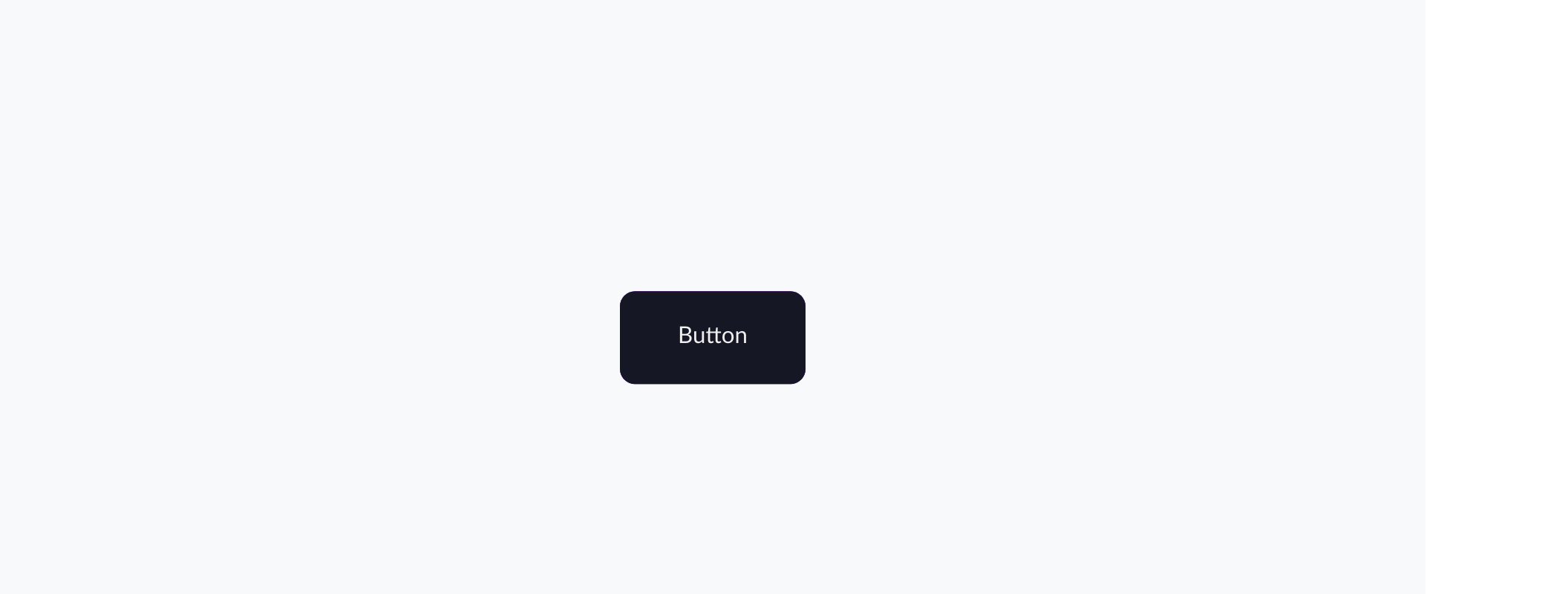
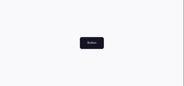
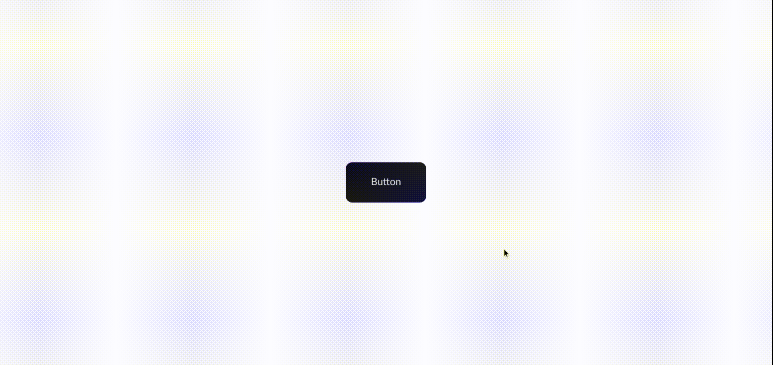
- Styling the button :
a {
    /* getting rid of the underline */
    text-decoration: none;
    color: #efefef;
    background: #161724;
    /* making button bigger */
    padding: 2.5rem 5rem;
    /* rounder border */
    border-radius: 1.3rem;
    /* I'll explain why i set the postion to relative, later */
    position: relative;
}
- Styling the hover effect :
I want to break down the effect into two parts :
Part one:
Part two:

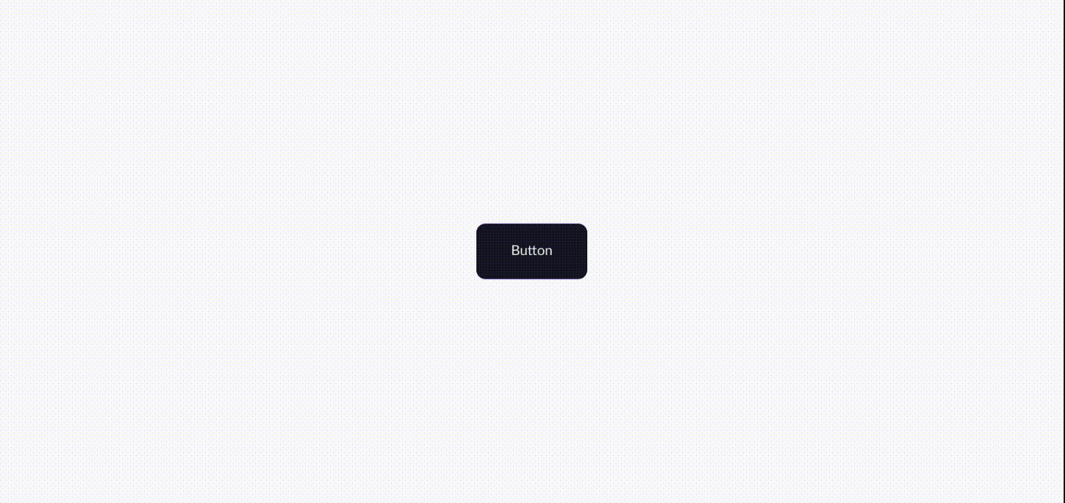
Before creating the glitch hover effect, first we need to create a pink and blue shape with before/after pseudo element.
Something like this:
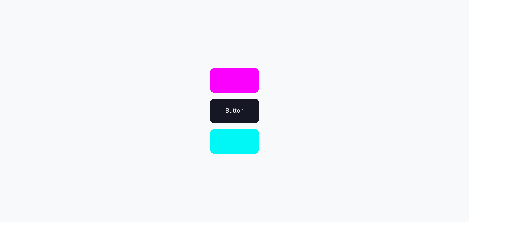
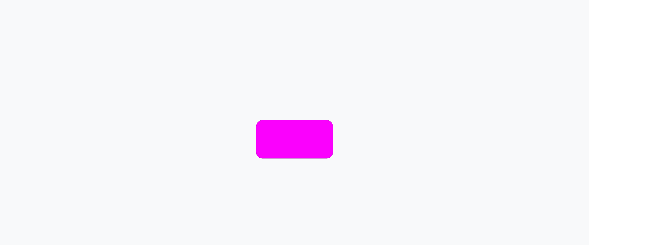
A. creating the pink shape :
a::after {
    content: "";
    display: block;
    /* Setting width and height to 100% creates a shape
    that is the same size as its parent */
    width: 100%;
    height: 100%;
    background: #fa01fd;
}
Now I need it to be in the same position as its parent and then behind the behind it :
A quick note! Remember when we set the anchor tag position to relative ?
a {
        position: relative;
}
It's because we need the child element (pseudo element) to be positioned absolutely to its parent (anchor tag) position.
Positioning the after pseudo element:
a::after {
    position: absolute;
    left: 0;
    bottom: 0;
}
And by giving it negative value z-index , it'll go behind its parent :
a::after {
    z-index: -1;
}
You can't see it now, but the pink shape exist and is behind its parent .
Here's the whole code snippet for after pseudo element :
a::after {
    content: "";
    display: block;
    width: 100%;
    height: 100%;
    background: #fa01fd;
    position: absolute;
    left: 0;
    bottom: 0;
    z-index: -1;
    border-radius: 1.3rem;
    color: #efefef;
}
And for the blue shape we do the exact the thing as we did for the pink shape :
a::before {
    content: "";
    display: block;
    width: 100%;
    height: 100%;
    position: absolute;
    background: #00f7f6;
    left: 0;
    top: 0;
    z-index: -1;
    border-radius: 1.3rem;
}
Time to create the hover effect :
Part one:
We will make this effect with @keyframes at-rule.
@keyframes blue {
    0% {
        transform: translate(0);
    }
    20% {
        transform: translate(-60px, 60px);
    }
    40% {
        transform: translate(-60px, -60px);
    }
    60% {
        transform: translate(60px, 60px);
    }
    80% {
        transform: translate(60px, 60px);
    }
    100% {
        transform: translate(0);
    }
}
what does transform: translate(-60px, 60px) do?
It's shorthand for transform: translate(x, y).
The x-axis moves in the horizontal axis (left and right) .
The y-axis is the vertical axis (top and bottom).
So transform: translate(-60px, 60px) will move the element 60px to the left and 60px to the top.
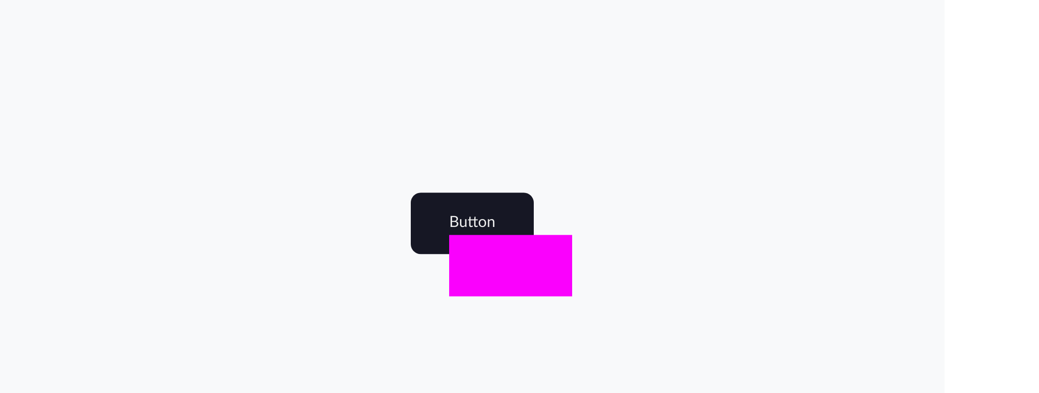
Here's slow-motion of how it moves :

We do the same animation for the pink shape but in the oppsite direction of blue shape :
@keyframes pink {
    0% {
        transform: translate(0);
    }
    20% {
        transform: translate(-60px, 60px);
    }
    40% {
        transform: translate(60px, 60px);
    }
    60% {
        transform: translate(-60px, -60px);
    }
    80% {
        transform: translate(-60px, 60px);
    }
    100% {
        transform: translate(0);
    }
}
If we put them together it would look like this :
Now how to actually add this animation to our button?
We do this with animation property .
 {
    animation: name duration iteration-count;
}
The animation-duration property sets the length of time that an animation takes to complete one cycle.
The animation-iteration-count property sets the number of times an animation should be played before stopping.
We want the glitch effect to happen on the hover, right?
But we want the effect to take action on pseudo elements (the pink and blue shape).
So instead of doing :
 a:hover {
    animation: name duration iteration-count;
}
which will effect the whole element (both parent and childs),
We will add animation property to its child :
a:hover::after {
    animation: name duration iteration-count;
}
/* Pink glitch effect */

a:hover::after {
    animation: pink .4s 2;
}


/* blue glitch effect */

a:hover::before {
    animation: blue .4s 2;
}
- What does
.4sdoes?
It's length time of animation, meaning it will take 0.4 seconds to complete the animation. - What does
2do?
It's the number of times an animation will be played.
Glitch effect need to happen/move fast, so I set duration to 0.4s , And I don't want it to end too soon ,therefore I set the iteration-count to 2 to repeat the effect 2 times.
You can also change the numbers and play around with the properties to see different effect.
You could end the effect here
Or you could make it a little bit more interesting :
@keyframes skew {
    0% {
        transform: skew(0);
    }
    20% {
        transform: skew(-50deg);
    }
    40% {
        transform: skew(10deg);
    }
    60% {
        transform: skew(-20deg);
    }
    80% {
        transform: skew(25deg);
    }
    100% {
        transform: skew(0);
    }
}
I want to skew the whole button, not just the childs, so this time I'll add animation property to anchor tag not the pseudo elements
a:hover {
    animation: skew .4s;
}
I don't want the skew animation to repeat itself more than once, therfore I will leave iteration-count alone.
And by putting all animations together, you will achieve this cool glitch effect
This tutorial turned out to be longer that I had anticipated lol .
Fun fact : I finished it in one sitting.
I hope you enjoyed this glitch hover effect tutorial !
 You can also connect with me on twitter 😊