How To Make a Card Component In React

web dev #Self_teaching (with the help of community) I write about the thing I wish I knew earlier...
What Is a Card Component?
When we talk about the term "Card", it usually means some kind of container look with rounded corners and drop shadows that you can warp around your elements.
Card component is a regular component. It will not be configured through some attributes. we wrap it around elements with our custom card component.
Why/When You Should Use It?
We use card components to keep our code clean and to avoid repeating our codes.
Let's say you have multiple card-looked elements and instead of repeating the same attributes (like border-radius , box-shadow etc) for every single of our elements, you could just wrap your elements around the Card component .
How To Make a Card Component?
I'll go through this step by step to show you what happens. It's best for you to just follow along and do these steps yourself.
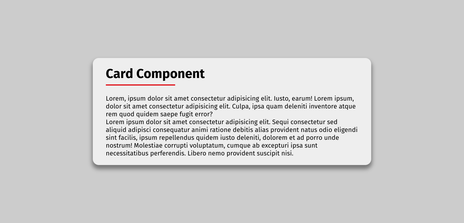
Now let's see how to make the below card component.
First, let's forget the whole thing and just make a CSS file (Card.css) where we want to extract the same attributes
.card {
  border-radius: 15px;
  box-shadow: 0 8px 10px 2px #777;
}
Then create your Card component Card.js
const Card = () => {
  return <div className="card">Card</div>
}
Note, don't forget to import your CSS file
import './Card.css'

const Card = () => {
  return <div className="card">Card</div>
}
Now we have a card-looked component that we want to wrap around some elements.
This is what we want to wrap our Card component around. A heading and two paragraphs.
const App = () => {
  return (
    <div className="container">
      <h1>Card Component</h1>
      <p>
        Lorem, ipsum dolor sit amet consectetur adipisicing elit. Iusto, earum!
        Lorem ipsum, dolor sit amet consectetur adipisicing elit. Culpa, ipsa
        quam deleniti inventore atque rem quod quidem saepe fugit error?
      </p>
      <p>
        Lorem ipsum dolor sit amet consectetur adipisicing elit. Sequi
        consectetur sed aliquid adipisci consequatur animi ratione debitis alias
        provident natus odio eligendi sint facilis, ipsum repellendus quidem
        iusto deleniti, dolorem et ad porro unde nostrum! Molestiae corrupti
        voluptatum, cumque ab excepturi ipsa sunt necessitatibus perferendis.
        Libero nemo provident suscipit nisi.
      </p>
    </div>
  )
}

Let's warp our Card component around the content and see what happens
const App = () => {
  return (
    // replace the root div with the Card component opening and closing   tag
    <Card className="container">
      <h1>Card Component</h1>
      <p>
        Lorem, ipsum dolor sit amet consectetur adipisicing elit. Iusto, earum!
        Lorem ipsum, dolor sit amet consectetur adipisicing elit. Culpa, ipsa
        quam deleniti inventore atque rem quod quidem saepe fugit error?
      </p>
      <p>
        Lorem ipsum dolor sit amet consectetur adipisicing elit. Sequi
        consectetur sed aliquid adipisci consequatur animi ratione debitis alias
        provident natus odio eligendi sint facilis, ipsum repellendus quidem
        iusto deleniti, dolorem et ad porro unde nostrum! Molestiae corrupti
        voluptatum, cumque ab excepturi ipsa sunt necessitatibus perferendis.
        Libero nemo provident suscipit nisi.
      </p>
    </Card>
  )
}

As you can see our content is gone and all we have left is the content of Card component which was just the word 'card'.
You can't just simply add content between your custom card component. It doesn't work like that. This is where we use a special prop called children .
So what even is a children prop?
Let's take a quick look at this special prop.
'Children' is a reserved name, meaning we don't create props for it. props.children simply refers to the content between the opening and closing tags of your custom component. So in our case, it refers to the content between the Card component (h1 and p)
(You can read more about children here, here or on StackOverflow.)
Now, back to our Card component .
const Card = () => {
  return <div className="card">Card</div>
}
We simply replace the content of this Card component with {props.children} , like this:
const Card = (props) => {
  return <div className="card">{props.children}</div>
}
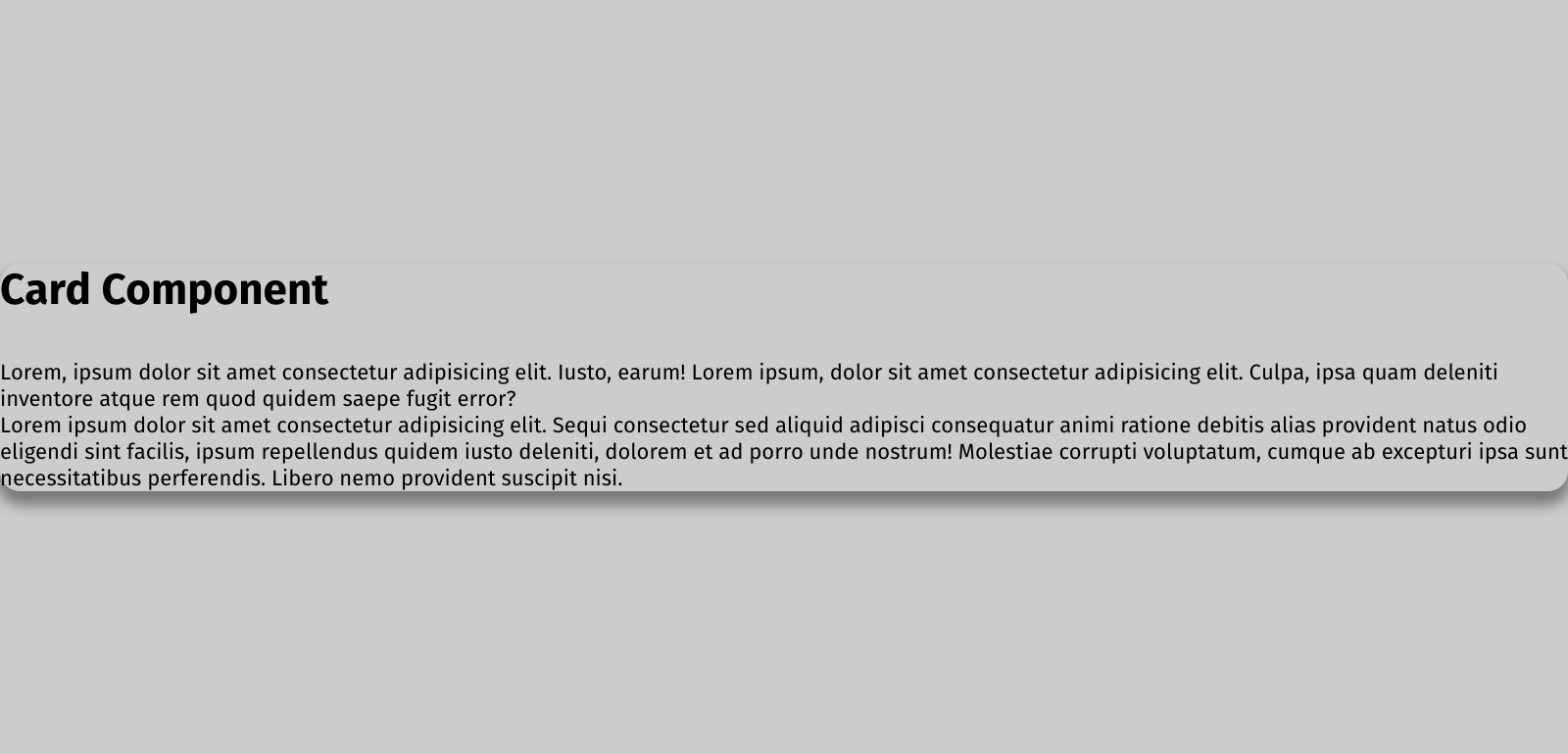
Now with the help of children prop we were able to get our content back. But what happened to the styles?
It was supposed to look like this, but it doesn't!
This is the final step, and to make this work, we need to create a variable (I named it classes), then pass the card class and className as props (props.className) to that variable (classes). And then pass/return the variable (classes) to className:
const Card = (props) => {
   // There should be space after the card class
   // props.className passes classNames as props
  const classes = 'card ' + props.className
  return <div className={classes}>{props.children}</div>
}
Note, You might have noticed that I added space after card class (classes = 'card ') and wondered why that is!
As I've mentioned, props.className passes classNames as props and adds them next to 'card ' . So when container class is passed down, there's enough room for it. That's why we had extra space there.
You could think of it as something like this:
<div class='card container'></div>
If you need the whole code snippets all in one place, you can use my codepen and GitHub page.
Codepen
Github
And that's a wrap on this article.
I hope you liked this ^_^
If you'd liked to connect with me, you can find me on Twitter @/nazanin_ashrafi


