In today's article I'll show you how to create a sticky navbar.
There's also gonna be two bonuses.
It's not really hard, all you have to do is :
ul {
position: fixed;
    top: 0;
}
BUT it could be tricky. So stay with me until the end of this article .
First thing first :
Setting up HTML
 <header>

        <!-- This is for our background image -->
        <div class="bg"></div>

        <nav>
            <ul>
                <li><a href="">Home</a></li>
                <li><a href="">Projects</a></li>
                <li><a href="">Contact</a></li>
                <li><a href="">About</a></li>
            </ul>
       </nav>
    </header>

  <section>
        <p>Lorem ipsum dolor sit amet consectetur, adipisicing elit. Vitae, unde sequi. Labore, tempora quos veniam sunt deserunt dolor autem ullam eligendi, accusamus laudantium dolore cupiditate dignissimos omnis? Suscipit, ipsam possimus?</p>
    </section>
Setting up CSS
A. Create a simple navbar
ul {
    width: 100%;
    background-color: rgb(0, 204, 255);
    display: flex;
    justify-content: center;
}

li {
    /* gets rid of the bullets */
    list-style: none;

    margin: 20px 25px;
}

a {
    color: #fff;
    font-size: 120%;

    /* gets rid of the link underline */
    text-decoration: none;
}
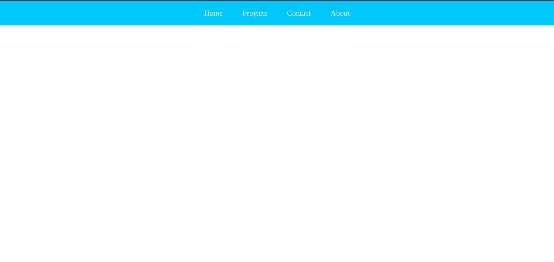
B. Create the background image or your texts or whatever you like, which in my case I created a background image
.bg {
    position: relative;
    width: 100%;
    min-height: 125vh;

    /* got the image from https://www.gavtrain.com/?p=6851 */
background-image: linear-gradient(rgba(0, 0, 0, 0.801), rgba(0, 0, 0, 0.801)), url(https://www.gavtrain.com/wp-content/uploads/2020/02/Neon-BG-Blog.jpg);
    background-position: center;
    background-size: cover;
    background-repeat: repeat;
}
And now if you scroll down, you'll see that the navbar will disappear
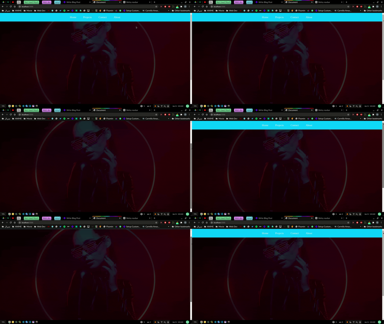
C. It's time to fix this mess by giving the ul element fixed positioning
ul {
position: fixed;
    top: 0;
}
This will fixate the navbar on top of the screen.
But as you can see (in the gif below) the navbar disappeared or it's better to say it went behind the background image.
Add z-index:1 ; to your ul element to fix this.
PS I briefly explained about z-index in this article
ul {
    width: 100%;
    background-color: rgb(0, 204, 255);
    display: flex;
    justify-content: center;
    position: fixed;
    top: 0;
    z-index: 1;
}
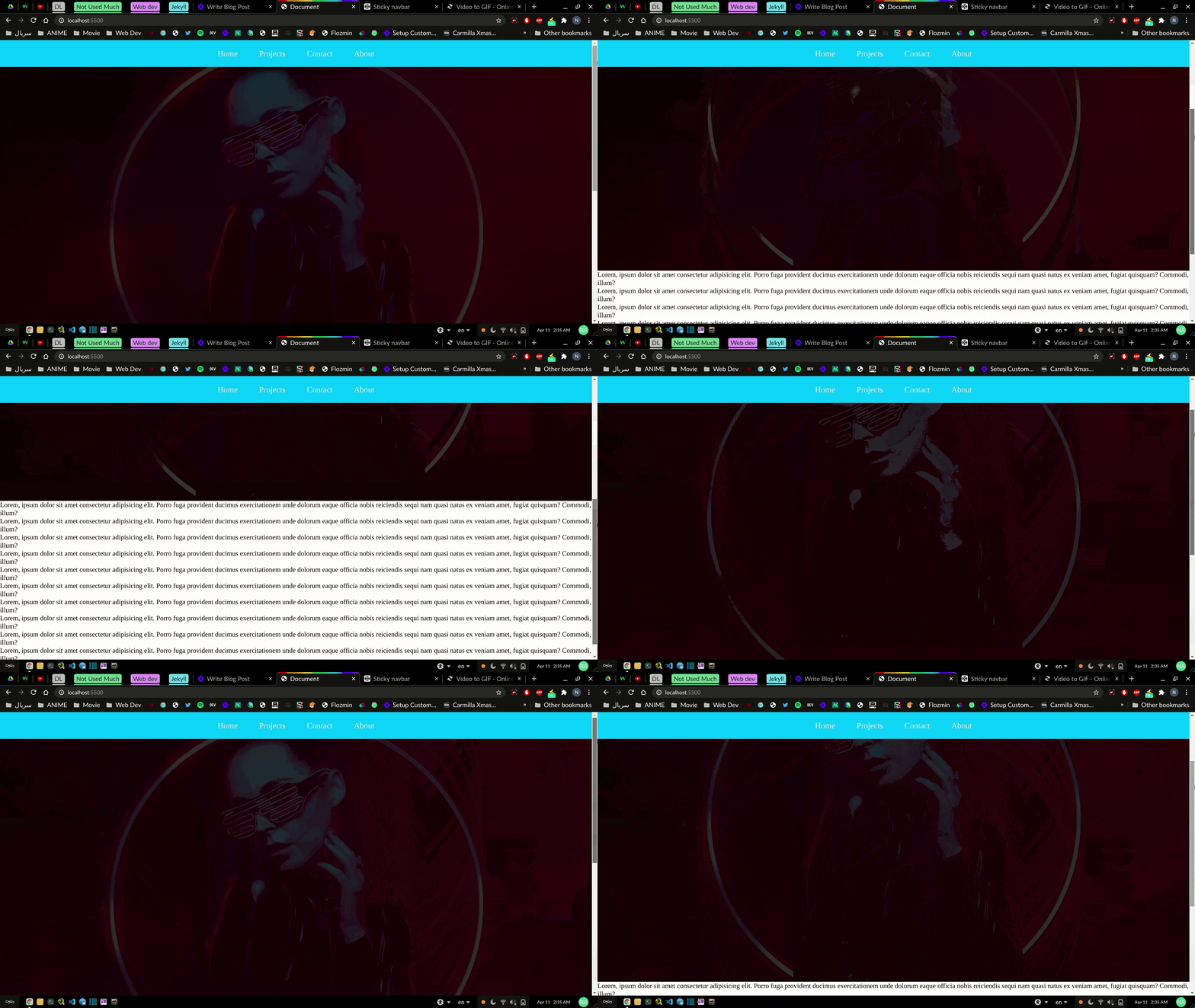
Congratulations, you just created a sticky nabvar 🥳🥳
This is the final touch up :
Bonus 1 : How to stop the navbar from overlapping
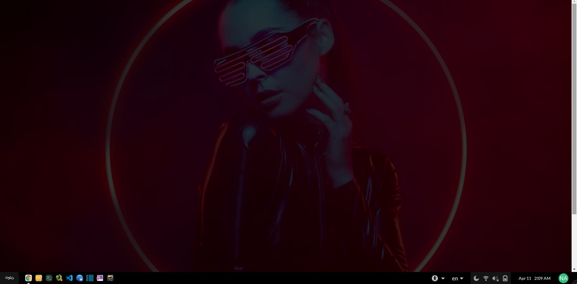
So this is the original background image
 (Got the image from here )
As you see the navbar overlapped on our element and a little bit of image went underneath the navbar
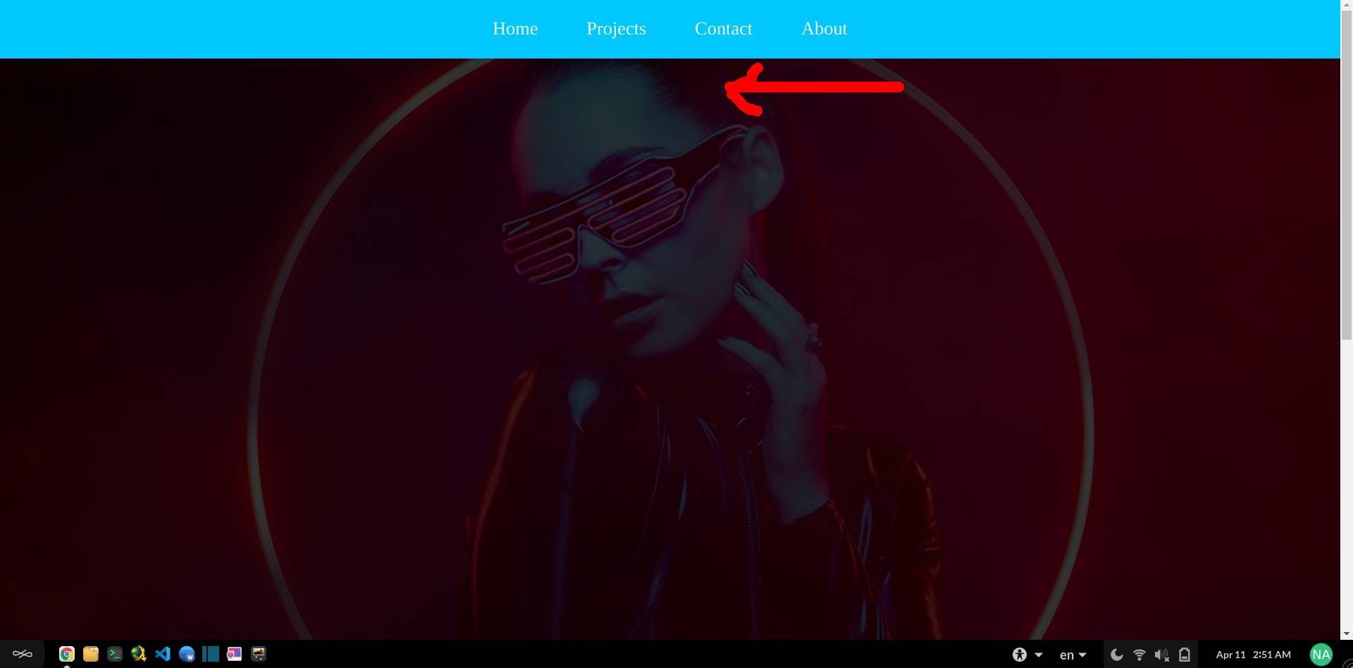
You can fix the overlapping by giving margin-top to the background
Fun fact : I just created a channel just to upload this short video lol
Bonus 2 :
For animating link underlines you can check out this amazing article
