


Creating a simple image gallery could be a little hard.
But thanks to flexbox for making it very simple and save us the headaches ! phew!
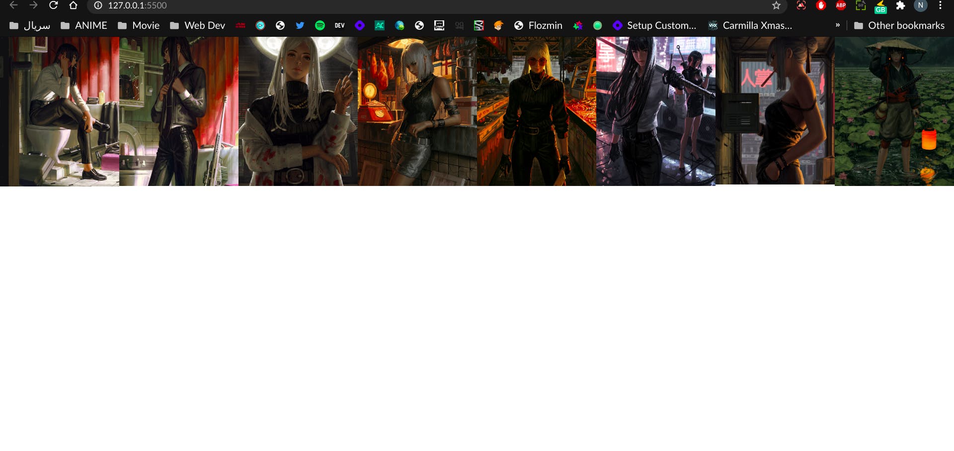
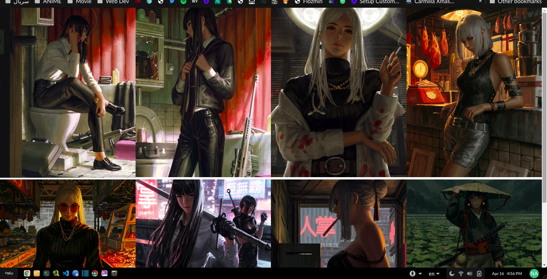
We're going to create something like this :
P.S. I originally used different pics for this article which I got them from GUWEIZ's twitter
Okay lets get started
Setting up HTML
Create an ul element and add your image
<ul>
        <li><img src="/img/new/Es568VFXYAARANj.jpeg" alt=""></li>
        <li><img src="/img/new/Es56_FqXMAUB_O4.jpeg" alt=""></li>
        <li><img src="/img/new/EvexIKIUYAAHw-L.jpeg" alt=""></li>
        <li><img src="/img/new/EvFHhxNXYAg59-F.jpeg" alt=""></li>
</ul>
Setting up CSS
First thing first:
Set the ul element's display to display: flex;.
  ul {
      width: 100%;
      display: flex;
  }
It will line up all the image in one line and no matter how many images you add, they will all end up being in that line
This is where flex-wrap: wrap; comes in to warp the images.
 ul {
      width: 100%;
      display: flex;
      /* as the name shows, it will wrap your images */
      flex-wrap: wrap;
  }
This is the final code snippet :
  ul {
      width: 100%;
      display: flex;
      flex-wrap: wrap;
  }

  li {
      width: 25%;
      /* gets rid of the bullets */
      list-style: none;
  }

  img {
      width: 100%;
  }
We just created a image galley.
But there's a little problem.
As you can see I sorted my images (vertically/horizontally).
What if my images are like this :
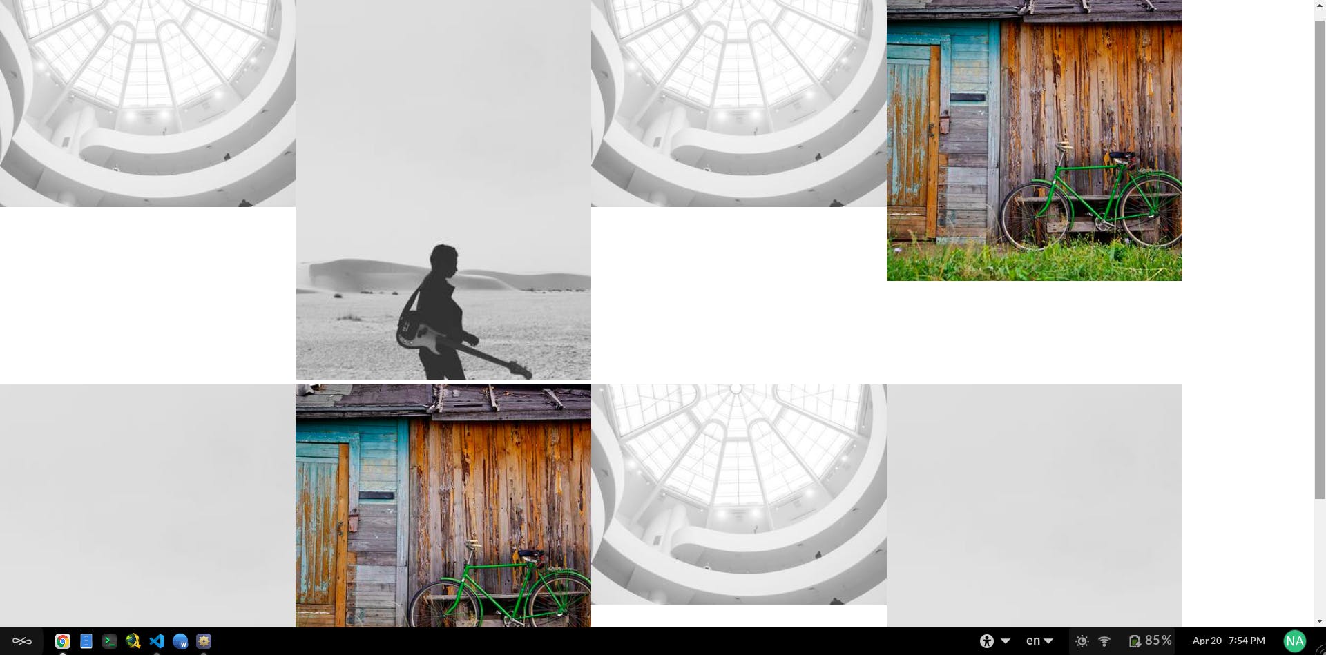
What if you don't want to sort your images? or you have lot of images and don't have time to sort them! What should you do then?
In the first method I sorted the images and set width for li element, but this won't work for unsorted images and will completely ruin everything ( like I showed you in the pic above).
From what I've learned from css tricks
, in a situation like this when you have unsorted images you need to set height for li element instead of width
and for img element you need to set max-height , min-width
ul {
  display: flex;
  flex-wrap: wrap;
}

li {
  height: 40vh;
  flex-grow: 1;
}

img {
  max-height: 100%;
  min-width: 100%;
  object-fit: cover;
  vertical-align: bottom;
}