

How To Blur Background Image Without Affecting The Child Element


Let's pick up where we left off last week.
So in last week's article I talked about getting rid of white borders.
And now we want to set the blurry image as background and add some stuff in front of it.
If you use the second trick, you don't even need to read this article but if you're gonna use the first trick then stay with me .
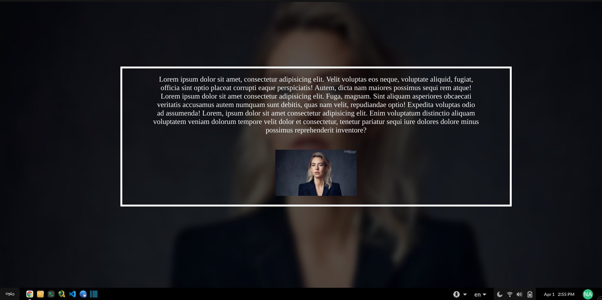
And now we want to learn how to do this :
The first thing you should absolutely avoid is doing this :
<section class="blurry-bg">       <!-- Don't use section element as your background -->
    </section>
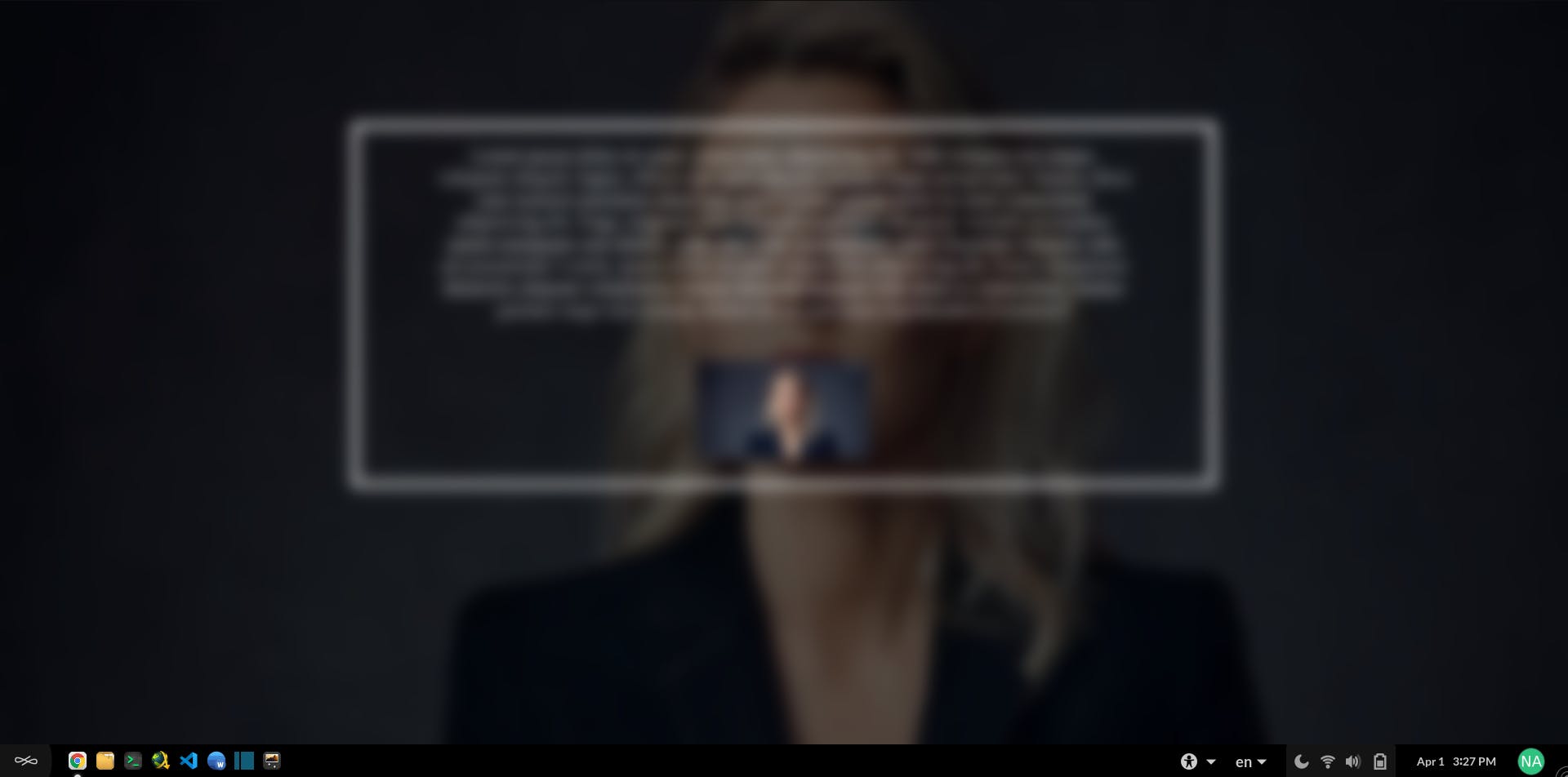
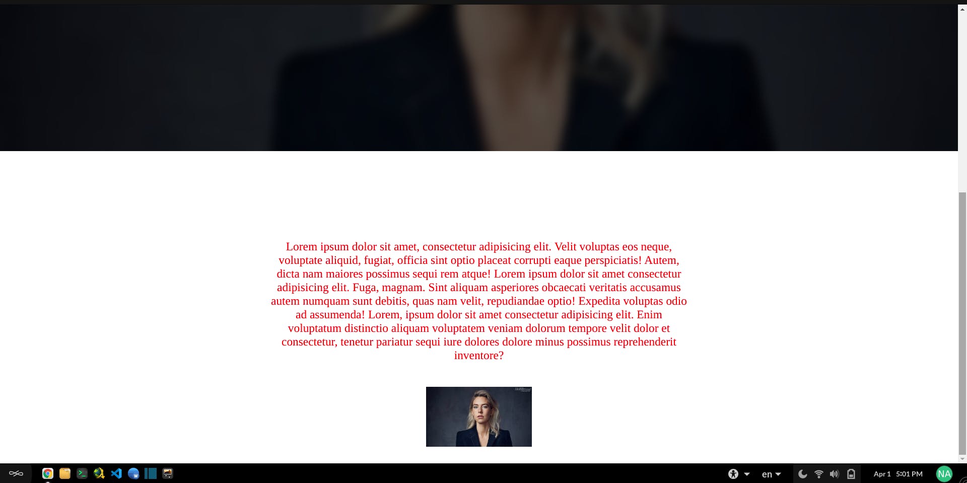
You need to create a new div inside your section and set a background image for that div. Because if you set it for your section, it will affect your child elements and things will get ugly , like this :
Instead do this :
 <section class="gallery-section">

<!-- Create a separate div for the background image -->
        <div class="blurry-bg"></div>
    </section>
Now we need to set an image as the background and then blurred it , like how we did it in last week's article :
.blurry-bg {
    width: 100%;
    height: 100vh;
    background-image: linear-gradient(rgba(0, 0, 0, 0.63), rgba(0, 0, 0, 0.623)), url(img/000333.jpg);
    background-attachment: fixed;
    background-position: center;
    background-repeat: no-repeat;
    background-size: cover;
}

.blurry-bg::before {
    content: "";
    position: absolute;
    width: 100%;
    height: 100vh;
    backdrop-filter: blur(5px);
}
After doing so , you can add your child elements
 <section class="gallery-section">
        <div class="blurry-bg"></div>
        <p>Some text here</p>
        <img src="/img/000333.jpg">
    </section>
But there's gonna be a little problem here. Your elements will go below the background.
We will fix it with relative/absolute positioning and z-index :
Set your background element to position: absolute; and the parent element to position: relative;
(which in our case is the section which I gave it class="gallery-section" )
 .gallery-section {
    position: relative;
}

.blurry-bg {
    background-image: linear-gradient(rgba(0, 0, 0, 0.63), rgba(0, 0, 0, 0.623)), url(img/000333.jpg);
    width: 100%;
    height: 100vh;
    position: absolute;
    z-index: -1;  <-- comment z-index and see what happens -->

}
You might wonder why we need z-index
Take a look at this pic

You see that blue layer ?
This is where your elements are right now. in order to bring it back up to the surface (green layer) we set the z-index of the background to "-1" , meaning we sent green layer behind our elements.
Here's the final touch
 <section class="gallery-section">
        <div class="blurry-bg"></div>
        <p>Some text here</p>
        <img src="/img/000333.jpg">
    </section>
 .gallery-section {
    position: relative;
}

.blurry-bg {
    width: 100%;
    height: 100vh;
    position: absolute;
    background-image: linear-gradient(rgba(0, 0, 0, 0.63), rgba(0, 0, 0, 0.623)), url(img/000333.jpg);
    background-attachment: fixed;
    background-position: center;
    background-repeat: no-repeat;
    background-size: cover;
    z-index: -1;
}

.blurry-bg::before {
    content: "";
    position: absolute;
    width: 100%;
    height: 100vh;
    backdrop-filter: blur(7px);
}
I've created a small project. You can check it out here
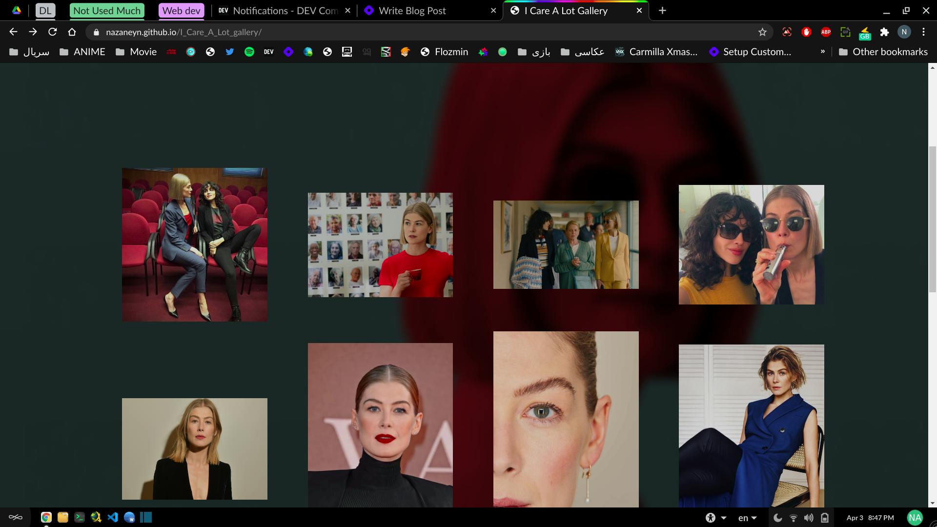
And here is the link to github